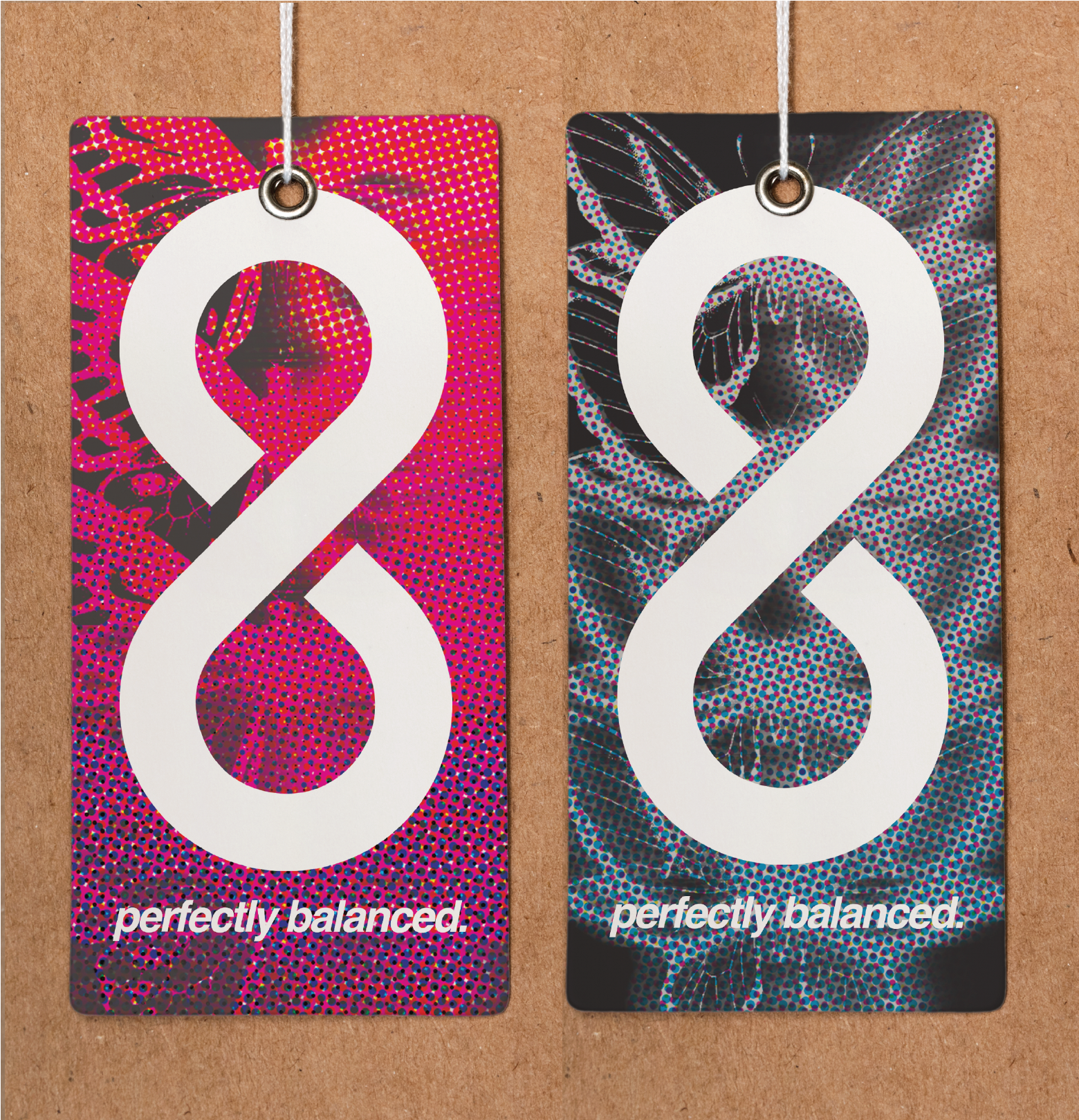
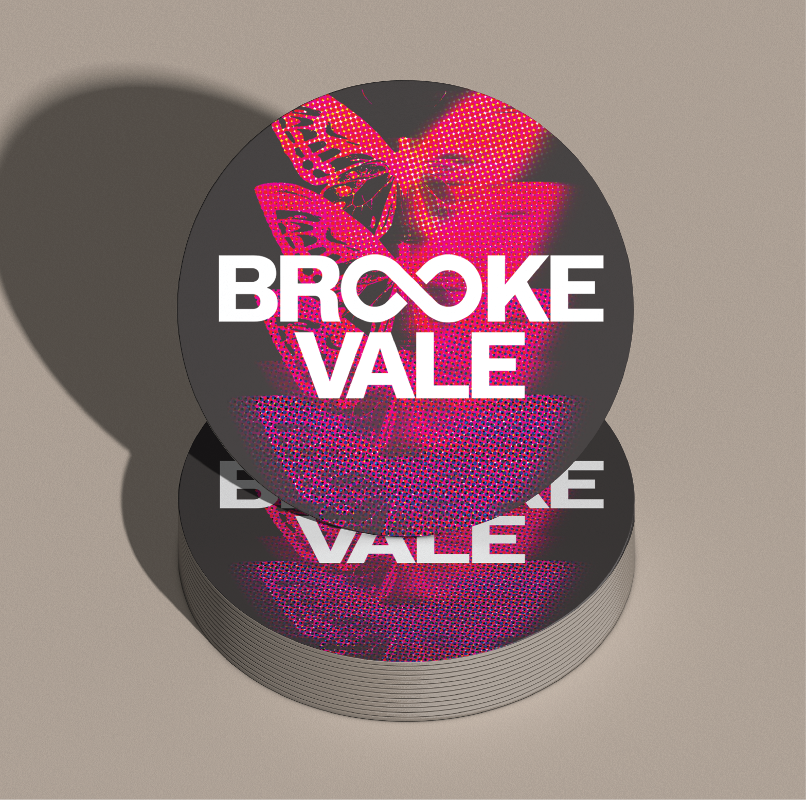
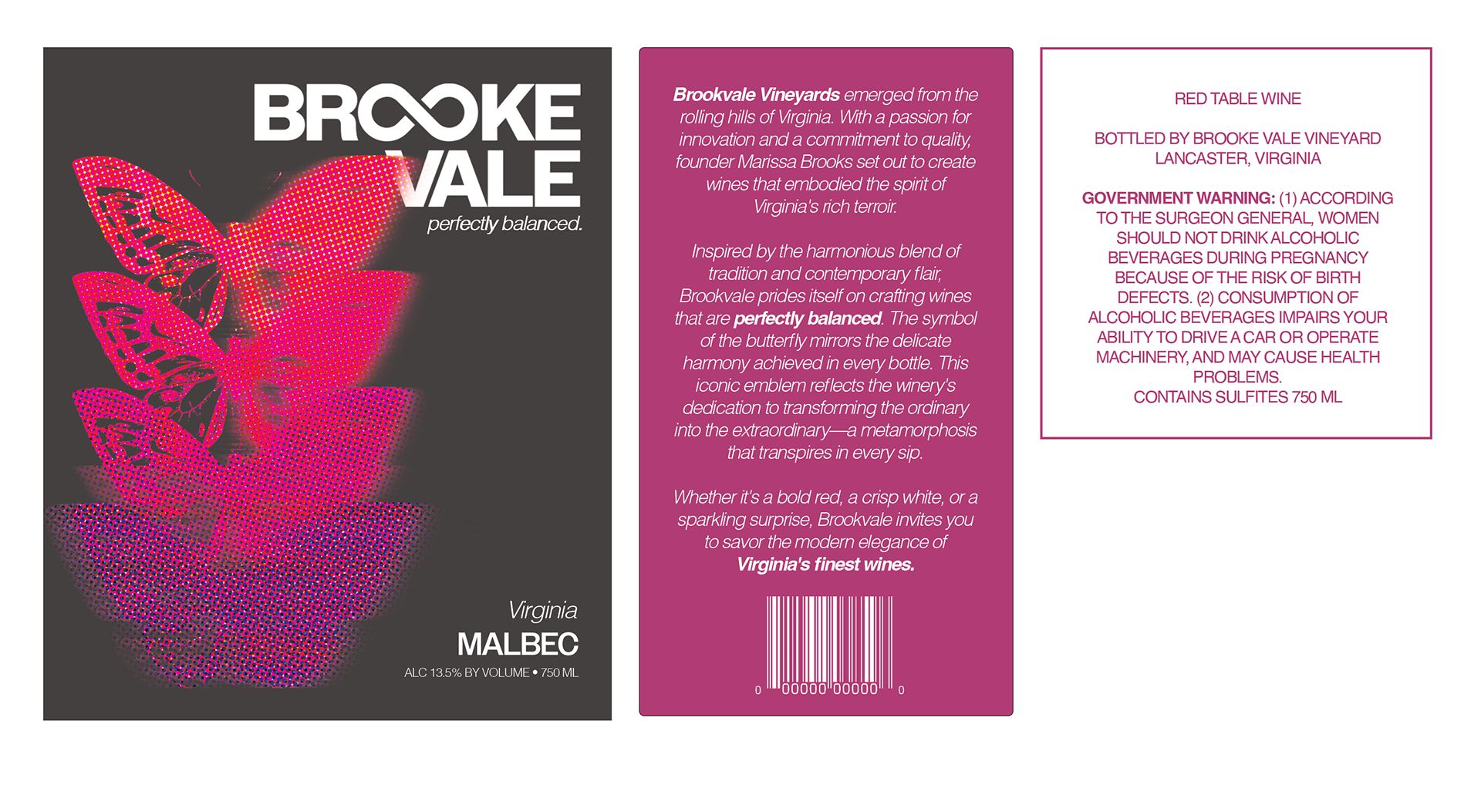
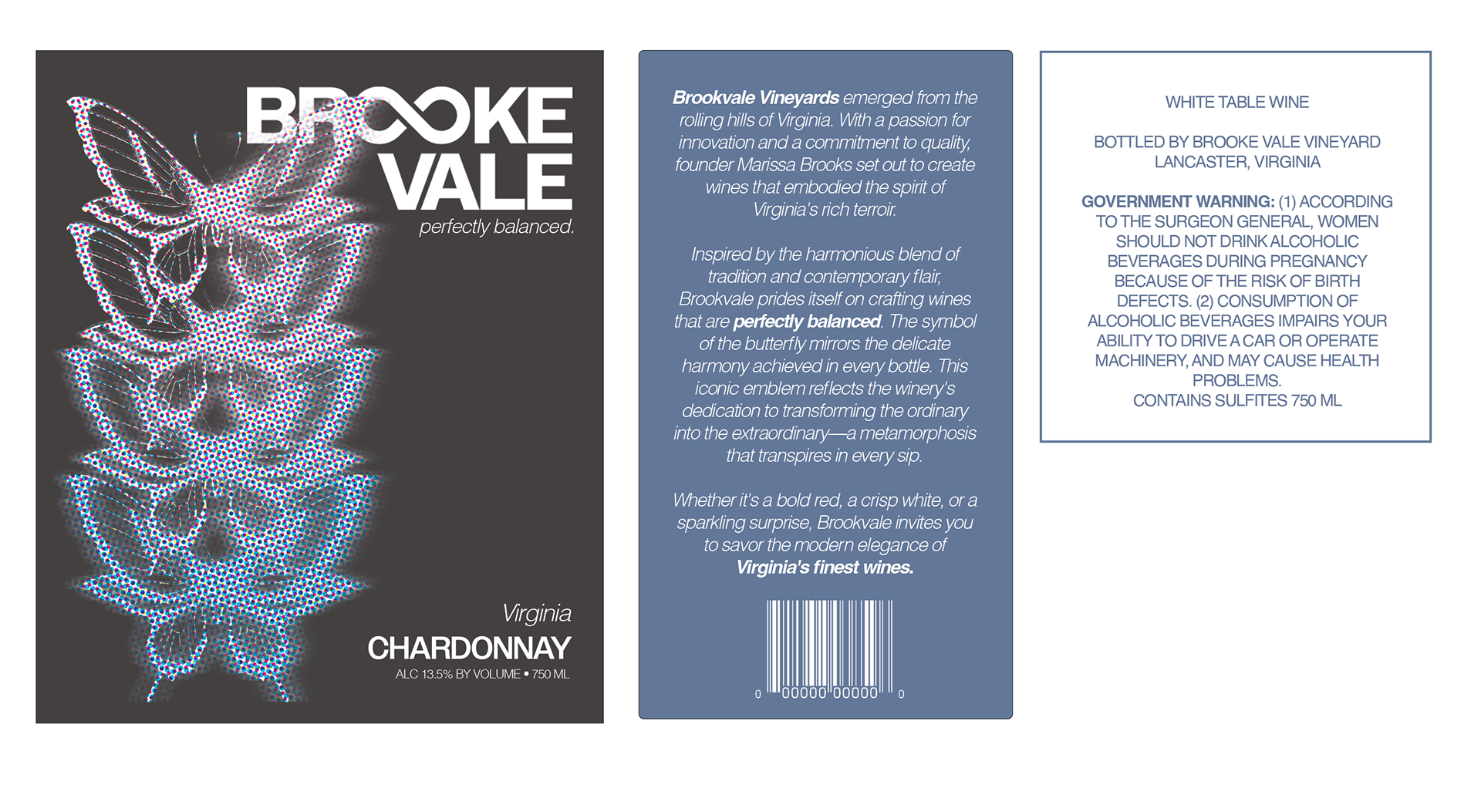
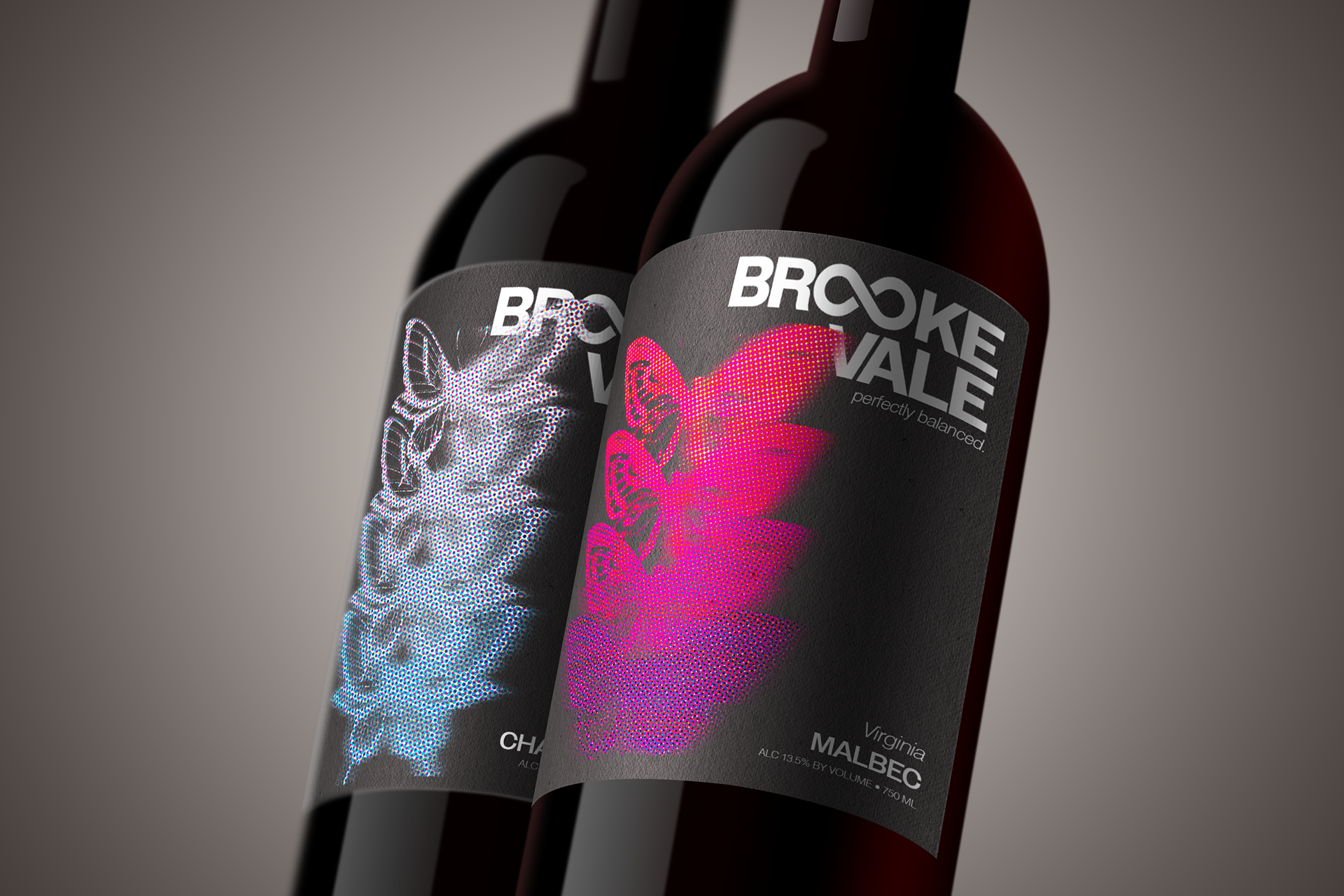
For Brooke Vale Vineyard's branding, there are two prominent symbols incorporated in all the collateral that represent the company's values. The infinity sign forms the two O's, showing that the wine is "perfectly balanced." The symbol of the butterfly mirrors the delicate harmony achieved in every bottle. This iconic emblem reflects the winery's dedication to transforming the ordinary into the extraordinary—a metamorphosis that transpires in every sip.
Brookvale Vineyards
(2023) For my Advanced Typography class, I designed a logo, two distinct wine labels, and supporting collateral for Brook Vale Vineyard. Each design complies with federal and state wine label text requirements. The primary objective was to create a clear and distinctive logo and labeling for both the red and white wines. Additionally, I designed a coaster and product hang tag to complement the branding and enhance the overall presentation of the products.